
Product Evaluation: Evaluate Messaging and Comprehension
Background
Doctors and health organizations have typically recommended yearly mammograms for women over age 40.
This is changing.
New clinical research has made mammograms for women aged 40-49 something optional. It is now recommended that women decide whether they should get a mammogram in consultation with their doctors.
Type of product: A letter to be sent to every female HMO member aged 40 to 49.
Goal of product: The letter would advise women that a mammogram is not longer required yearly. The letter seeks to drive women to get their questions answered via a special webpage.
The client developed the initial draft of the letter and webpage explaining the risk of getting or not a mammogram for this age group. This messaging was new for the organization and therefore risky.
Research Questions
- Was the call to action clear? The call to action was for the patient to consider her options given the risks and to visit the webpage for more information.
- After reading the letter, do readers understand the information about why a mammogram is no longer recommended? What questions? Did the webpage address the questions adequately? The client was concerned the letter would generate new customer service inquiries or visits to discuss mammograms.
- How likely is the reader to go visit the webpage after receiving the letter?
- Might the brand be tarnished? The letter advocates for women to consider getting fewer services. As an HMO, the organization was also concerned that a communication advocating for “less preventive testing” be perceived cynically as a way to cut costs. Would this show up as a concern?
Constraints
Each project has constraints. I’m adept at working within constraints of time, budget, and availability of participants and settings.
Recruitment: The client wasn’t able to recruit actual users of its services. Participant recruitment occurred through friends and family. This led to a group of women who had a slightly more favorable opinion of organization, adding possible bias. Additionally, participants tended to have a higher level of education than the general population.
Research methods constraints: Ideally, this research would happen by direct observation of participants in their home receiving the envelope with the letter. This is because I was attempting to evaluate their real world response.
However, this wasn’t feasible in the timeline. Additionally,this client didn’t have an established process for handling home visits. The in-lab study instead simulated the receipt of the letter, and asked how likely the participant would be actually visit the webpage with further information.
Process
I performed a heuristic review of initial draft to recommend improvements to call to action and readability.
In this case, the heuristics used were not the typical UX heuristics from Nielsen.
Instead, I used heuristics associated with:
- Editing best practices, such as the principles found in Letting Go of the Words.
- Health literacy and plain language, such as Health Literacy Online.
- Web writing best practices, such as Usability.gov’s Web Writing guidelines.
Then, in a lab setting, I performed a usability test with focus on comprehension of the letter and webpage. One of the challenging aspects of the communication was understand the risks of getting a mammogram at this page.
Finally, to assess how much the information affected users’ decision-making, I used a survey to assess how likely they were to have the mammogram.

Findings and Design Recommendations
Comprehension and call to action findings:
- The eight women in the target age group who were tested found the letter and webpage easy to understand.
- One woman mistakenly thought the letter was reminding her to get a mammogram.
Design Recommendation
Through visual design, make it clearer that this letter is not a typical reminder about getting a mammogram.
Although participants understood the call to action, they were not likely to actually complete it due to the difficulty in accessing a webpage during the letter opening process.
Workflow issue findings:
- Unsurprisingly, most participants thought it was unlikely they would visit the webpage noted in the letter. It was just too inconvenient to “change channels” from paper to online. They would just set the letter aside instead, and maybe visit the webpage later.
Workflow recommendations:
Because readers were unlikely to visit a webpage after reading about it in a letter, it’s important to include all relevant information with the letter.
Therefore, a second page of frequently asked questions should be included in the letter. It’s unrealistic to count on women visiting a webpage. In the future, the organization should develop the ability to send this letter via email with a clickable link.
Presentation slides
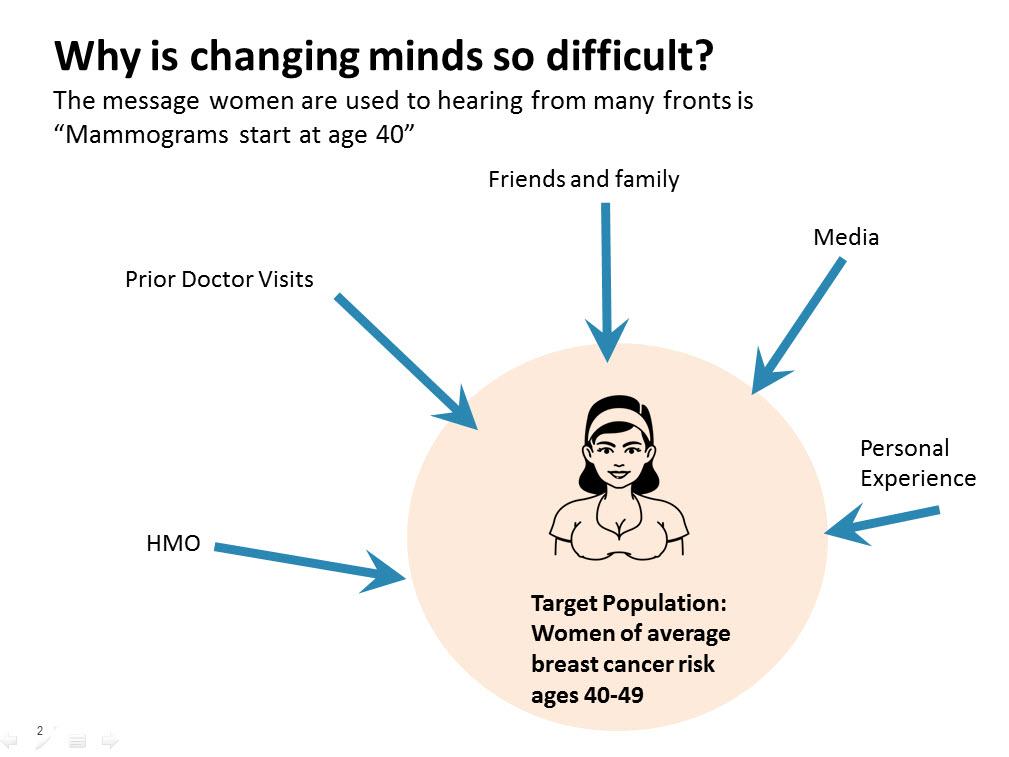
These are slides used in a presentation to executive and physician audience. Through the use of visual imagery, I am conveying that women have been hearing the message of “get a yearly mammogram” for many places, for many years. A new message — noted in yellow — will require a different approach over time to become convinced about this new mammogram recommendation. Click to enlarge.

Findings and Design Recommendations
Likelihood of getting a mammogram in this age group
Findings
A key question was if participants would change their current practice of getting mammograms, given the new information.
Would learning about the drawbacks of getting a mammogram keep women from getting a mammogram again? To test this, participants were asked how likely they were to get a mammogram before and after reading the letter and webpage
Interestingly, none of the participants revised their score of “likelihood of getting a mammogram.” Why is that? A possible explanation rests with “choice-supportive cognitive bias,” or the human tendency to ascribe positive attributes to a choice you’ve already made. In fact, all participants had already had at least one mammogram and felt good about it.
It’s difficult to get an individual to soberly reassess a decision they’ve already made due to this bias.
Design Recommendations
Program design
The principle of “choice-supportive bias” was a factor in the participants’ willingness to consider a different choice. Participants who had already chosen mammograms were less likely to reconsider this choice.
The organization should target women earlier in their mammogram decision process, even before age 40. The process of deciding whether or not to get a mammogram starts way before age 40.
Message design
Additionally, the organization must strengthen the message to get through to this group, since most other sources such as media are reinforcing the “get a mammogram” early and often message.
About this Project
A thorough client consultation
The research plan is contingent on knowing what the product is meant to achieve. How can you judge the success of the product if you don’t know the intended outcome, or if the objectives are unclear?
Early in the engagement, I focus on crisply defining what are the main priorities for the product.
This is often a clarifying moment in the client consultation. Because the product developer is balancing so many inputs and points of view, they often have lost track of the purpose of the product. The consultation will help elicit the objectives of the product. All else flows from there.
Extracting the product objectives:
- Have the client commit to objectives of the product on paper.
- Create a straw man of the product objectives as a researcher by looking at background documents.
- An elucidating question is: “if this product is successful, users will….” and “if this product is unsuccessful, users will…”
- If possible, prioritize the list of objectives. In a design process, there will always be trade offs so knowing which are the top priorities will serve you well in making recommendations.
How can a heuristic evaluation help?
This is an “inspection method” type of evaluation. It’s done by professional trained in the respective principles most relevant to the product.
Another way of thinking about heuristics is a review of whether the product is abiding by “best practices.” Note that heuristics have a basis in human perception, cognition, and behavior. These are not arbitrary rules. For example, short paragraphs and bulleting of content is important because it’s supports the way people read on the web. They scan, they lose interest with long paragraphs.
Heuristics relevant to this product:
- Nielsen’s 10 Heuristics: In many technology products where interaction is the main concern, the most relevant heuristics will be the ones like what Nielsen developed.
- In content-heavy products like this one, the heuristics you want to apply relate to best practice for web writing, and marketing.
- Behavior change principles – this explains why it’s unlikely someone will put down a piece of paper and go to the web. The behavior is hard, so someone must be extra-motivated to do it.
- Cognitive biases – these are useful to know for any complex product. They help explain that “social proof” underlies why it’s effective to show “101 of your friends like this product.”
Learn more
Are you a woman aged 40-49? Here are a couple of trusted resources for deciding whether to get a mammogram at your age.
- My Doctor Online Northern California – Breast Cancer Screening Information for Women Ages 40 to 49
- Interactive Tool on Kaiserpermanente.org: When Should I Start Having Mammograms?
References
- BJ Fogg’s Behavior Model comes in handy for products where you want the user to take action.
- Mental Notes are a set of cards with psychology principles relevant to product design.
Skills Used
This was a “soup to nuts” project where I was involved in every phase of research:
Planning research
- Client consultation
- Determine research method
- Heuristic evaluation
- Participant screener development
- Participant recruitment
- Moderator guide development
- Survey development
Execution and presentation
- Research moderation
- Analysis
- Report writing
- Presentation to executives