Ubiquitous UX
User Experience is All AroundWatch what they do, not what they say
This is is one of the cornestones of user research: users don’t know what they want and can’t predict what they’re going to do.
When you ask them to predict what they would do, you are at risk of getting garbage data. This challenge comes up frequently in creating tests for features that don’t yet exist, say, with prototypes. Asking users, “do you want to use this” isn’t as effective as getting an idea of their user needs and then designing an experience that takes care of it.
To design the best UX, pay attention to what users do, not what they say. Self-reported claims are unreliable, as are user speculations about future behavior. Users do not know what they want.
From the oldie by goody article by Nielsen: First Rule of Usability? Don’t Listen to Users.
Colorblindness
Colorblindness runs in my family. Even one of my female cousins has it. I’m sensitized to it especially because I seem to have a touch of it. I sometimes can’t tell green from blue. Or I swear something is blue when everyone seems to think it’s green — remember those curtains in the dining room?!
Ways to avoid confusing colorblind people with your visual design:
- Use another “redundant” signifier.” Not just color – but color and underline to show something is a link, for example.
- Create good contrast between lettering and the background is essential for colorblind people, and for aging eyes. This can be checked with online color analyzers.
User researchers like me can help point out when the contrast or colors you’ve picked for your site are apt to confuse colorblind people.
If you’re interested in the topic, this presentation from another UX designer talks about the basics.
Metaphors in Design

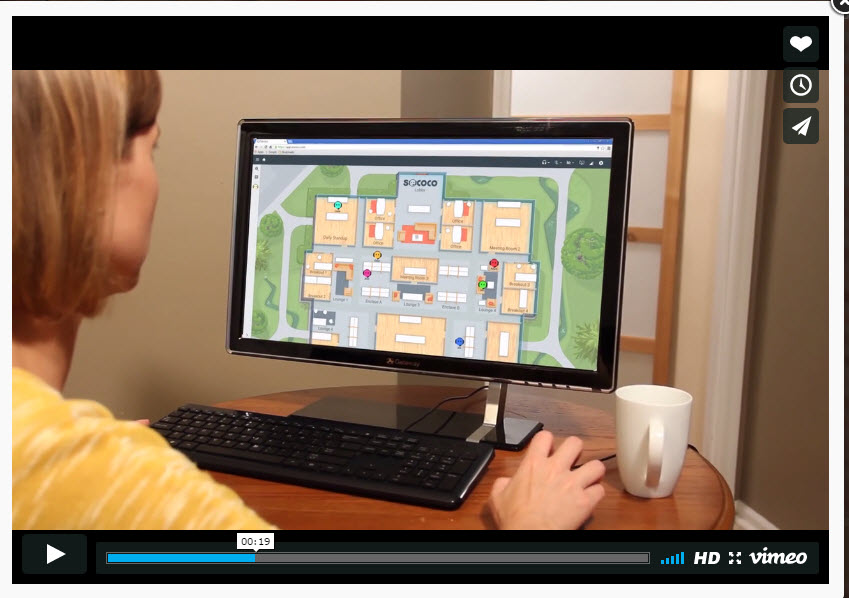
A new remote collaboration tool called Sococo uses the metaphor of the “office” even though all team members aren’t physically together. This is like a more literal “Webex” or “Gotomeeting.”
The intro video shows the scrum master convening a meeting in a meeting room and going around the circle, as you do in agile. Each individual is shown as a circle with headphones. Funny!
There’s a hot debate about the use of visual metaphors in design. Apple phones moved away from it recently. The “notes” feature is no longer like a legal yellow pad. The gist of the argument is metaphors both inform and constrain meaning. This means that by giving you the legal pad metaphor, you’ll take it quite literally… you won’t think it’s possible to paste a .jpg photo there because you can’t really do that on a legal pad. But you can on the mobile phone!
“[iOs] Notes is an abomination, but it is not an abomination because it leverages cultural meanings, or because it attempts to channel a physical analogue in its form. It is a poor interface because it is a clumsy and inelegant implementation that takes the metaphor of a notepad far too literally. A better effort would be to distill the idea of a “note” to its absolute essence, and to extend it with the unique capabilities afforded by a mobile touch screen device.” Adaptive Path article called “The Constraints and Opportunities of Metaphor”
On the plus side, Sococo is extremely easy to understand and learn given its strict interpretation of the office metaphor. On the minus side, digital tools have special powers that real conference rooms do. These are obscured by the metaphor.
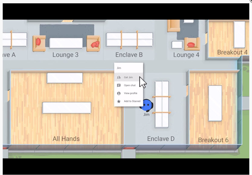
“Can someone grab Jim for the meeting?” The screen grab on the right shows someone “getting Jim” to come to the meeting.
I’ll see you by the water cooler virtually in 5 minutes!

“Day in the Life” Exercise to Build Empathy
London truck drivers were required to be on bicycles for a day in order to build empathy for bicyclists they share the road with everyday.
“I was sceptical about the training. However when I did it I was surprised. Cycling with a truck beside you is genuinely scary. I am glad I got to see that for myself and can now play a role in making the streets of London safer for cyclists,” says a driver.
%20(1).jpg%20title=Cyclist%20and%20lorry%20(copyright%20Simon%20MacMichael)%20(1).jpg>)

