
City of Berkeley Site: Information Architecture
Background
Like many government sites, the City of Berkeley site contains information about city services and functions. It aims information at residents, local businesses, visitors, and voters.
The focus of the site is on helping users become informed or solve problems through reading of relevant content. There are also transactions, such as paying bills or signing up for services.
The challenge
The project’s aim was to create a cohesive approach to address information architecture issues and the overwhelming amount of content on the site. Findability of relevant content was a key issue. This shortcoming led to calls to city offices asking for information that was present in the site.
Additionally, self-service tools were not easy to find and thus underutilized. This project didn’t focus on look and feel, as this require separate approach related to branding.
Business Goals of Redesign
- Increase ability for users to find needed content in the first try
- Reduce calls to city by providing effective self-service web content
- Reduce the need to know the exact name of desired task or city department that fulfills it
- Increased collection of fees by creating awareness of these and through promotion of “pay bills” functionality
Process
- Expert review using established usability principles
Phase 2 Process (not shown here):
- In depth content analysis: Further work is necessary to understand the menu items that go together; a content inventory would gather all the function and content associated with it.
- Stakeholder interviews: Interviews with city staff would illuminate which topics are associated with one another.
- Card sorting user research would give direction how users would group the many items in each section
- Label development and testing – plain language label development and testing these with users after IA categories are firmly established.
- Visual re-branding
Deliverables
- Catalog of major problems with IA, menu, and labels
- Revised IA for site
- Detailed site map with re-organized content
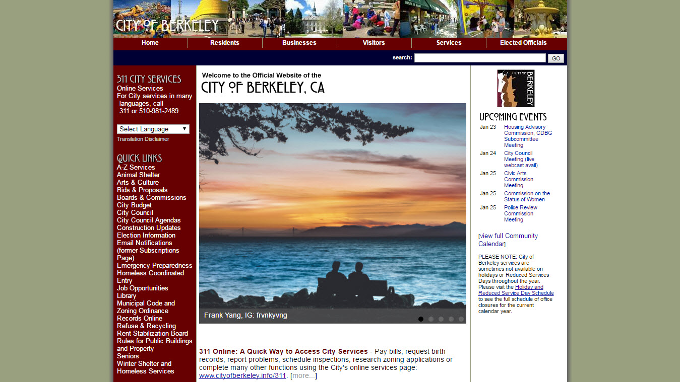
City of Berkeley Landing Page
Current site navigation buckets
Expert Review Summary
The site is comprehensive and contains a huge breadth of content. It clearly represents a valuable resource for the city and its constituencies.
In addition to a dated look and feel, the biggest issue lies with organization of content:
- The top level categories are too broad and second level navigation contain too many items; these show little relationship to one another
- Serious navigation issues exist throughout the site.
- There are excessively long menus, unclear left side navigation, and lack of signaling to users where they are on the site.
- Label issues also exist, with many functions being not accurately described by current labels.
- Site organization and labels are not task oriented, and rarely assist users in understanding if site has content they want, and where it may be located.
Overall, this site presents many obstacles for both experienced and new users to find the content they need.
Specific site challenges are detailed below.
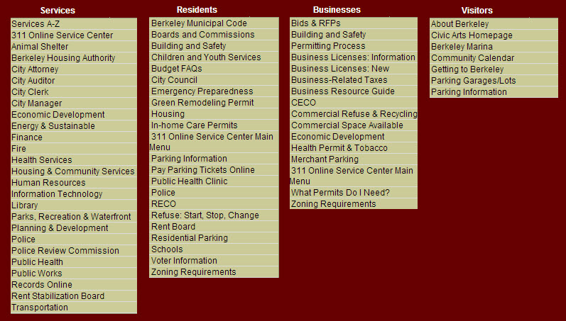
Nav Issue 1 - Too many items in the drop down menu
- Each of the drop down menus contain more than the recommended 5 to 7 menu items.
- Residents tab, for example, has 22 items
- This is a global issue that is present throughout the site
- All other sections shared this issue: Businesses, Visitors and Services
- Effect: this number of menu items causes users to struggle to learn the site and understand where they have visited; users can typically only remember 5-7 items
Four main navigation categories with menus open
.
Nav Issue 2 - Repetition of menu items on landing page for each category
- Landing Page provides redundancy with horizontal menu
- For the section entitled Residents, the drop down menu and the landing page (what you reach if you click “residents”) provide the exact same set of links. The green boxes outline the same menu items present in two different locations.
- Effect: Added confusion to navigation. Due to large number of links, it’s hard for the user to understand that this landing page is redundant with the top level navigation. This page add no value, but does add confusion.
Nav Issue 3 - Lack of thematic grouping of menu items
The drop down menus show items that are related to the top level navigation, but these are not organized further.
Lack of thematic organization of links
- The drop down menu links are not organized thematically; it is alphabetical
- This is present in all the horizontal top level navigation links.
Effect: This requires the user read and consider each item singly.
- This type of organization does not help users understand if site has what they are looking for
Nav Issue 4 - Lack of consistency with menu titles
“Services” is a top level navigation, which breaks that convention of persona-based navigation established by “Residents”, “Visitors,” and “Businesses”.
This area also had label issues:
- “Services” label is unclear: not a good descriptive category in that everything that a city provides can be construed as a service.
- There are dozens of important items hidden behind Services A-Z; many of these are repeated in the secondary navigation for Services
- Effect: Valuable items are ignored within “Services”.
Recommendation for Nav Issues 1-4
Create thematic categories under top level navigation
- Combine items thematically; add titles to further inform what the links pertain to
- More categories would require fewer secondary navigation items and create thinner menus, which is good
- Benefits: improve overall clarity of navigation.
Phase 2 work will inform thematic groupings and labels via:
- Content analysis
- Stakeholder interviews
- Card sorting
- Label development and testing
Nav Issue 5 - Unclear signaling of location
- Department names appear in large letters unexpectedly.
- In example at below, link clicked was Getting to Berkeley, and page appears to be about the City Manager at first glance.
- This is because the City Manager is in charge of this page and the functions noted within it.
- This approach is not used consistently, which makes it even more difficult to understand it.
- Once the menu closes, there is no visual indicator of where on the site one is.
Effect: This organization-focused approach challenges the user to understand where they have arrived after clicking a link.
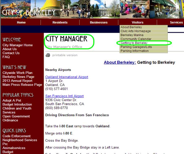
Nav Issue 5: Unclear signaling of location
Remedy
- Create clear visual signal of where user is in the navigation, such as breadcrumbs.
- Deemphasize the author or owner of the content; a smaller label that explains ownership has value so that user knows where to get further help. However, this should be secondary to the content.
Nav Issue 6 - Left side navigation links change with each page
The left side contains a menu that changes with where you are in the site.
- The user will easily miss that this menu has changed. This is because this area is typically associated with persistent navigation that doesn’t change. Further, the headings don’t change (Popular Topics, Quick Links), while the items under it do. This makes it nearly impossible to notice the changing menu.
Effect: This approach doesn’t signal to users that items on left side nav have changed and further erodes the user’s ability to navigate.
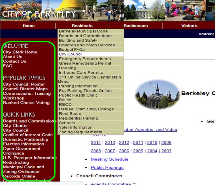
Nav Issue 6: Left side navigation links change with every page, but without signaling
Remedy
- Move changeable, associated links to a different location, such as right side.
- Create titles that give clues to relationship between links and the main body. For example, “You may also like” or “also of interest”.
Content styling issue
- The home page has four different styles and sizes of text
- Some links (see arrow on the lower left) wrap to two lines, but lack of spacing makes this difficult to notice
Effect: this makes the already full page appear even messier. It’s harder to understand what is clickable.
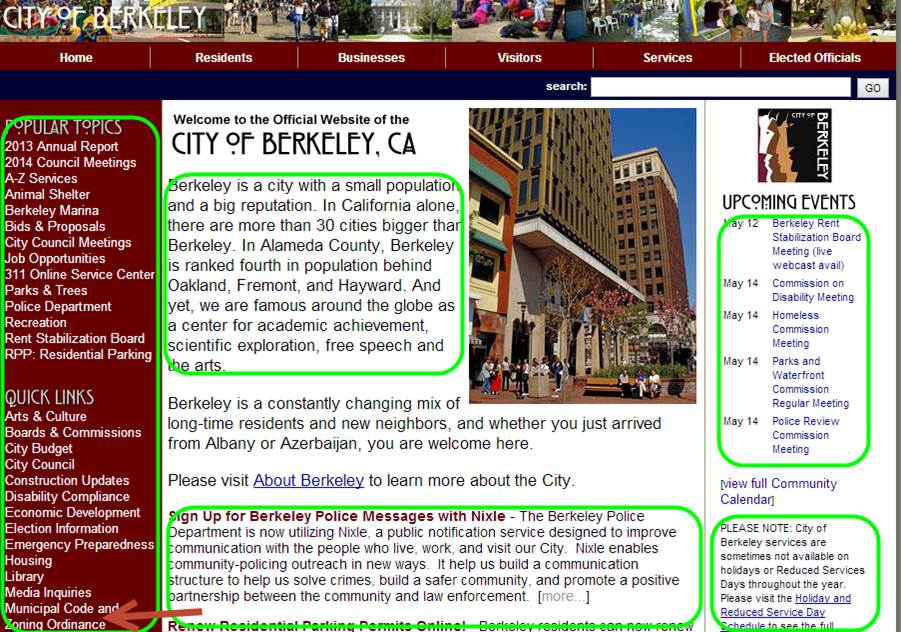
Content visual styling is varied
Remedy
- Use fewer styles in one page
- Use a theme with less tight spacing and more white space
- Avoid different fonts and font sizes
Navigation issue 6 – Unclear signaling of location.
The link clicked was Getting to Berkeley, and page appears to be about the City Manager at first glance.
Proposed Redesign
Proposed Redesign Navigation
New organization buckets are proposed to accommodate the diverse, rich content available
Organization scheme is partially persona-based:
- “Residents”, “Businesses” are dominant categories
- “Our City” contains information that anyone may need
- Items previously under “Services” have been redistributed contextually to associated personas, viz “Residents” and “Businesses”
- The needs of visitors will now be addressed by a different site. Most functions related to city attractions will remain in “Our City”, but rewritten to focus on needs of Residents
“Elected Officials” tab is reorganized and renamed to contain all “Government” services. This category now contains city service offices as well as information on elected officials.
“Organization of City Services” is proposed to explain services by City Departments and Offices
- This city-centric view of services is sometimes useful and necessary for residents and businesses. There is value in seeking to orient users.
Current top level navigation

Proposed new navigation buckets
Utility Navigation
Top utility navigation attends to finding important information easily
- Search box
- Search logic needs to be improved to provide more value
- How do I…?” organizes common tasks using everyday language
- 311 Berkeley is a phone number for question related to city services
- “Pay bills” fulfills site’s revenue-generation goals
Footer navigation
- As a public service organization, contact information must remain prominent and available
- Departments, Phone Directory and Contact Us are featured here
- “A-Z Services” provide another way into content for those who already know what they want
- A major initiative that affects everyone is placed in footer
- “Emergency Preparedness” doesn’t fit neatly in a single category and gains more prominence by being placed in the footer
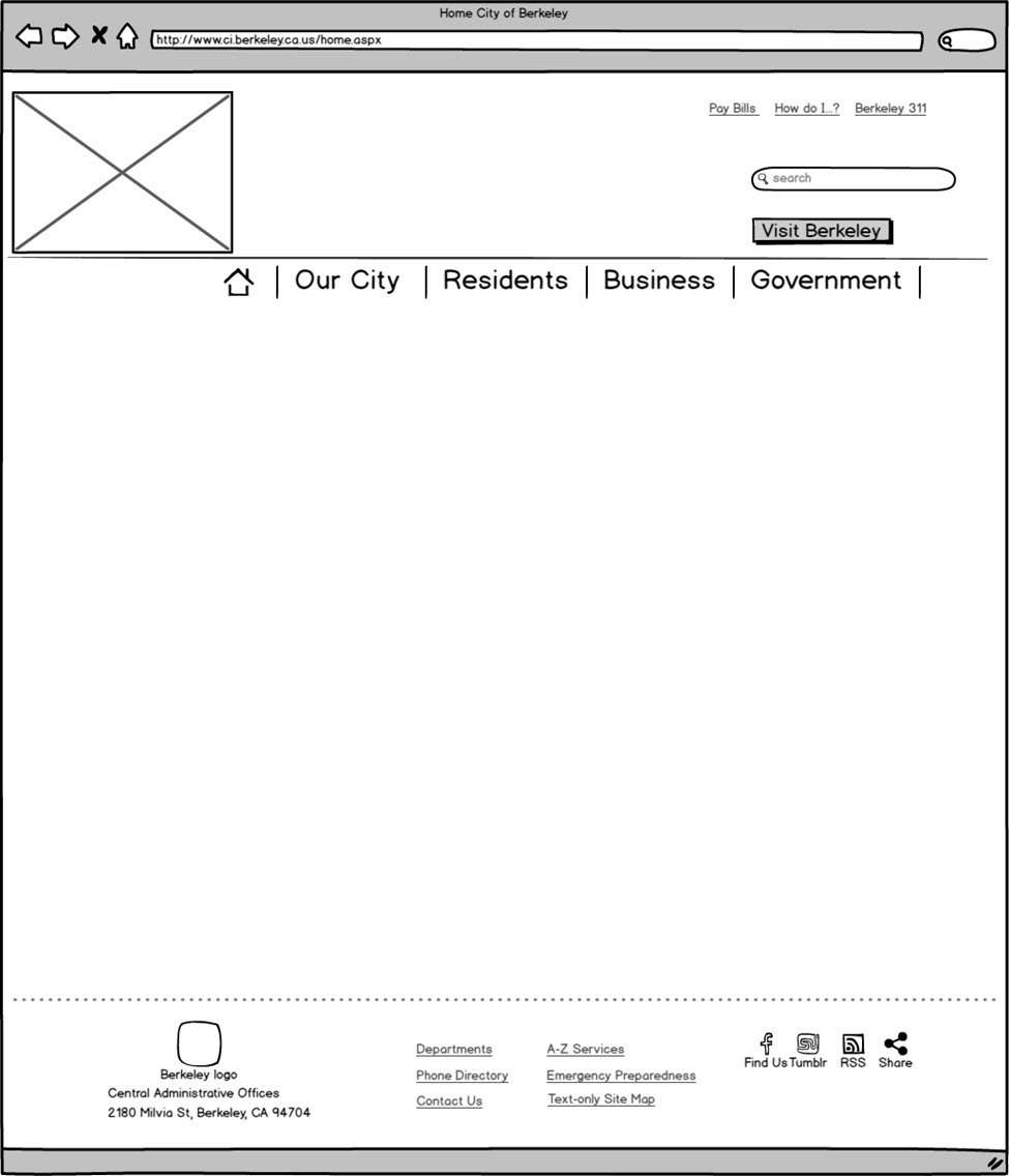
Top and bottom utility navigation
Use of Associative Content
The new organization makes extensive use of associative content
- Associative content is ancillary but closely aligned to the content featured in the main body of the page
- It seeks to place important content “in the path” of the user
Some content will exist only as Associative content; this will appear contextually in more than one place
Examples:
- Energy Assistance Program is found under “Renters” and “Homeowners” areas
- “Permits & Licenses” is found contextually under activity that may require one, such as under Residents’ “Planning new construction” or “Business”
Principles for design for a content-rich site
- Wireframes reflect a site that seeks to fulfill user tasks through content
- Content is front and center
- Navigation pages seek to inform user of what options are available through use of explanatory text, not just a list of titles of articles
- Associative content is present all levels, except deepest pages
- Pages with “consumption” content have no associated content
- Breadcrumbs assist users know where they are, especially if they have arrived here through an external search
Selected Wireframes
The following proposed wireframes are available for review:
- Home page
- Second Level navigation page surfaces up content from lower levels
- Navigation page one level lower
- Content consumption page
These wireframes follow down a single topic within Residents area:
1) Home page
- Top navigation is horizontal area in large font; menus are drop down
- Two content containers provide area for changing news and calendar of events
- Four boxes highlight top links for each of the four main sections
- Upper left logo area would include City of Berkeley name

2) Navigation page
- This second Level navigation page surfaces up content from lower levels
- Page introduces topic and gives context to allow user to choose between items
- Associative content appears to the right, and serves content related to any topics in body (this is labeled “Did You Know” in the mock up, but could be retitled.)

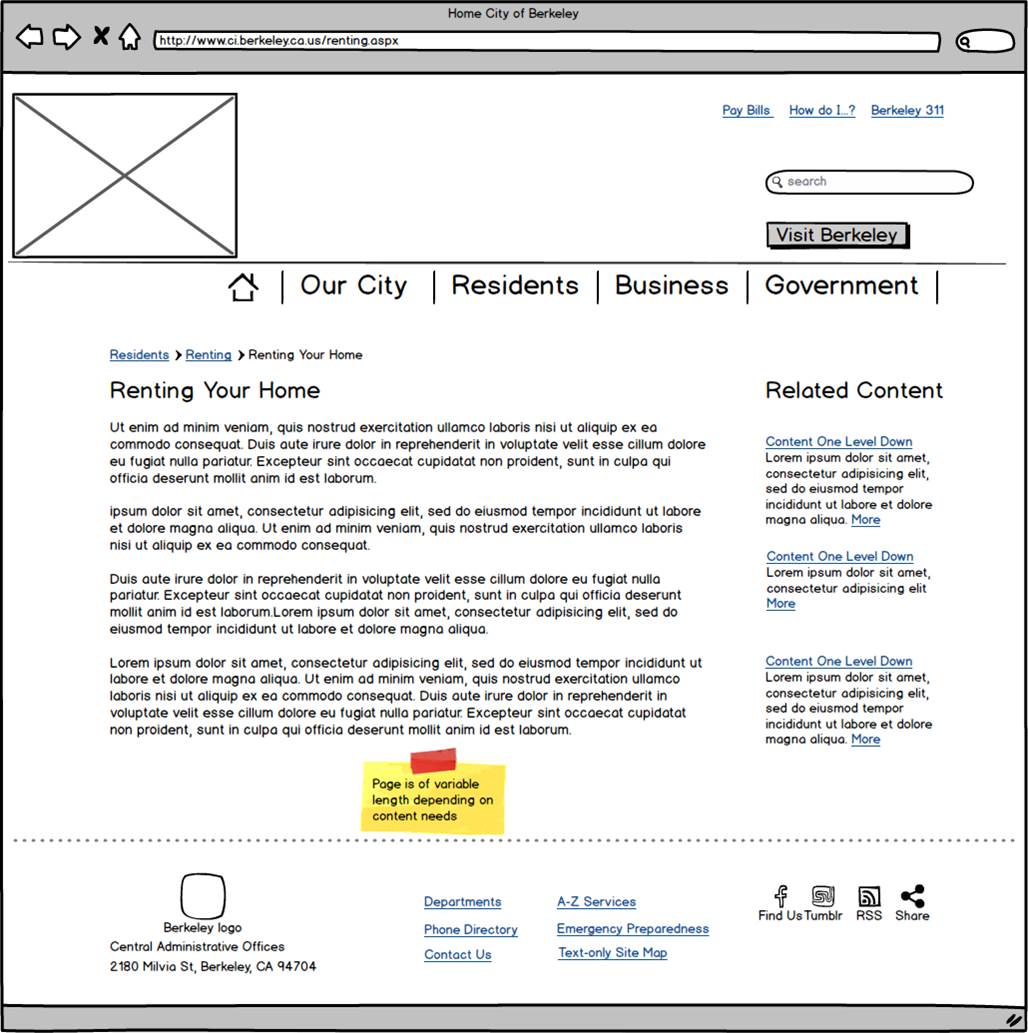
3) Hybrid Navigation & Consumption Page
- This navigation page is one level lower and has an area used for associated content where similar content may be found.
- For example: “Renting your home” is the main topic, but related content deeper in the navigation may discovered via Related Content on right.
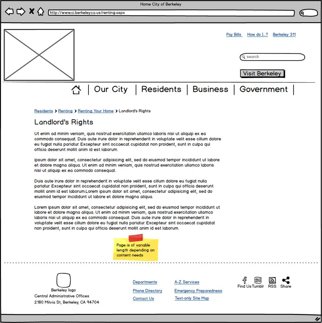
4) Content consumption page
- The focus on this page is reading of content with minimal distractions. This is an “end of the line” article where associative content is not necessary.
- In this example, the “destination” content is three levels down. In other parts of the site require consumption pages at a higher level of navigation.
Conclusion
There are extensive issues with City of Berkeley website. These are a combination of problems in information architecture, navigation and labeling.
As a content-rich site, successful web pages should be simple and uncluttered to allow the content to shine through and keep users focused on reading the content.
Proposed redesign relies on robust information architecture first, and simple, uncluttered design second.
- Further work to validate information architecture with users is necessary for greater confidence in the categories and organization.
This is an extensive project, requiring a complete overhaul.
- However, a more usable site experience is within reach for the City of Berkeley. Neighboring cities have already invested in restructuring their sites.
- A successful site will yield a return on investment characterized by an increased use of self-service and less reliance on higher cost channels.
Key skills:
- Content analysis
- Heuristic review
- Information architecture development
- Wireframing